(not satire – it’s the UK)
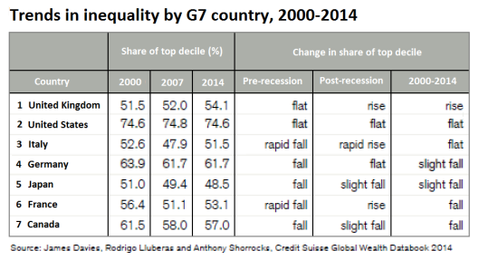
Here’s a useful table which shows how inequality has changed in the G7 countries since 2000.
It compares the % wealth share of the top 10% (decile) of the population:
And before anybody accuses me of peddling ‘left-wing’ propaganda – the data was compiled by that well-known hotbed of socialist thinking Credit Suisse.
.
Please feel free to comment. And share. Thanks:


Pingback: Britain is the only G7 country with rise in inequality | Alternative News Network
Well it wouldn’t be left wing propaganda, would it? …Because most of that period was under the last Labour government.
I’m pleased that you’re highlighting the failings of both the Labour and Tory governments.
LikeLike
Labour are left wing?
LikeLike
Ha ha! Good point!
LikeLike
Labour and Tory Governments have run out of ideas and the Liberal Democrats are completely finished, on their backs, with their legs in the air. The only solution is to vote UKIP or Green Party in the next Election.
LikeLike
why has guy fawkes been banned?
LikeLike
Fenriss: How do you know guy has been banned? — He was warned several times not to talk about ‘sock puppets’…. He may have been placed under house arrest by MI5, because we are now coming up to November the 5th…, 🙂
LikeLike
Actually guy fawkes is a she, not a he.
LikeLike
No you’re well wrong there everyone knows that guy is … a guy’s name…. I suppose you may not be who you say you are also, and are you into this ‘sock puppet’ propaganda theory malarkey as well?
LikeLike
No. In fact Ms Fawkes told me herself that she’s female, and we had several conversations about her sex and marital status…… but of course she may have been lying. On an anonymous forum you can pretend to be any age, sex, profession, etc., but your words will always eventually reveal what matters.
LikeLike
Pingback: Britain is the only G7 country with rise in ine...
The Greens will not win over 300 MPs in 2015 to form a majority government in England and Wales by themselves.
But in England The Greens could form a coalition pact with Labour, and The Greens take on board pensions and benefit, where Labour are losing voters, especially the prolific voters over 50s that voting UKIP blindly, without looking at policy (which is how most voters now vote as they’re not interested in politics nor bothered to learn).
If Labour talked up The Greens to the over 50s voters, then that coalition would win big in 2015.
There is, of course, the really out-field idea, of right wing Labour MPs transferring to UKIP and the left wing Labour MPs to The Greens now, leaving Miliband and Balls behind.
Because in passing the TV the other day, when Miliband was in debate with Cameron, Miliband was wearing a tie the exact colour of UKIP’s logo.
What is the betting after the lies told on the doorstep to get the union kept together, that in Scotland in 2015 all parties but the SNP and Scottish Greens, who were pro independence, are voted out of Scotland’s parliament?
We live in exciting times.
I have yet to hear back from The Greens if us early retired women in lieu of redundancy in austerity job cuts, on tiny works pensions not even half the way up the the basic tax allowance, would get a pro rata Citizen Income, that would be an amount the same as the basic tax allowance?
The Greens’ universal Citizen Income offers a non-withdrawable basic wage for all, without all the cruelty of being left without food money of the current benefits system.
The Greens’ policy make no mention of state pension payout age, but only of flexible retirement age as people choose. Two things that should never have been put together, as the ring fenced National Insurance Fund has been full for decades, not needing a top up from tax. But the Greens’ say they would end NI and have the Citizen Income and State Pension paid from general taxation.
I remain confused dot com and await clarification.
LikeLike
Pingback: Britain is the only G7 country with rise in inequality | Britain Isn't Eating